Tutorial: llmPrompt Compose
Cover Page
This part of the tutorial introduces you to the Android app development environment. You’ll learn some Kotlin syntax and Compose features to build reactive UI declaratively. Let’s get started!
Expected behavior
Posting a prompt and receiving and displaying streamed response:
DISCLAIMER: the video demo shows you one aspect of the app’s behavior. It is not a substitute for the spec. If there are any discrepancies between the demo and the spec, please follow the spec. The spec is the single source of truth. If the spec is ambiguous, please consult the teaching staff for clarification.
Be patient, the app on your device or emulator will be very slow because we’re running on debug mode. Depending on the resources on your development platform and device, it could take several seconds after launch for the app’s first screen to show up.
Preliminaries
Before we start, you’ll need to prepare a GitHub repo to submit your tutorials and for us to communicate your tutorial grades back to you. Please follow the instructions in Preparing GitHub for Reactive Tutorials and Projects and then return here to continue.
If you don’t have an environment set up for Android development, please read the course notes on Getting Started with Android Development first.
Creating an Android Studio project
In the following, replace <YOUR:UNIQNAME> with your uniqname. Google will complain if your
Package name is not globally unique. Using your uniqname is one way to generate a unique Package
name.
Depending on your version of Android Studio, the screenshots in this and subsequent specs may not look exactly the same as what you see on screen.
In the following, replace YOUR:TUTORIALS with the name of your tutorials folder.
- Click
New Projectin “Welcome to Android Studio” screen (screenshot) - On
Phone and Tablettab, selectEmpty Activity(NOTNo Activityand NOTEmpty Views Activity) and clickNext(screenshot) - Enter
Name: Agent (screenshot, showing all fields below) -
Package name: edu.umich.<YOUR:UNIQNAME>.agent 👈👈👈replace
<YOUR:UNIQNAME>with yours, remove the angle brackets,< >Android Studio may automatically change all upper case letters in
Nameto lower case inPackage name. If you prefer to use upper case, just edit thePackage namedirectly. -
Save location: put yourAgentfolder in 👉👉👉/YOUR:TUTORIALS, whereYOUR:TUTORIALSis the name you’ve given your assignment GitHub repo clone in Preparing GitHub for Reactive Tutorials and Projects. -
Minimum SDK: leave it as is or choose API 34 (Android 14.0) -
Build configuration language: Kotlin DSL (build.gradle.kts) - Click
Finish
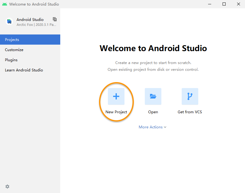
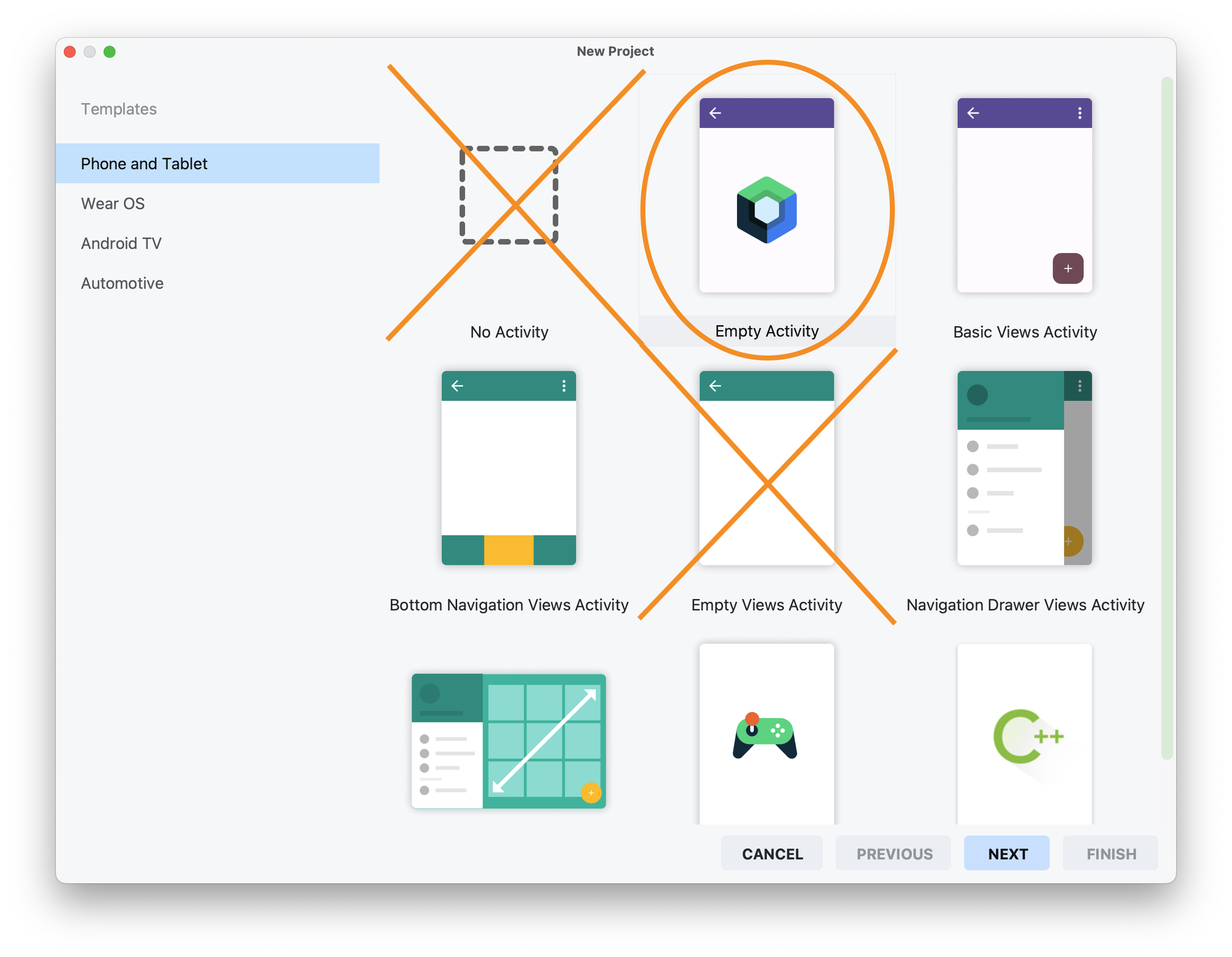
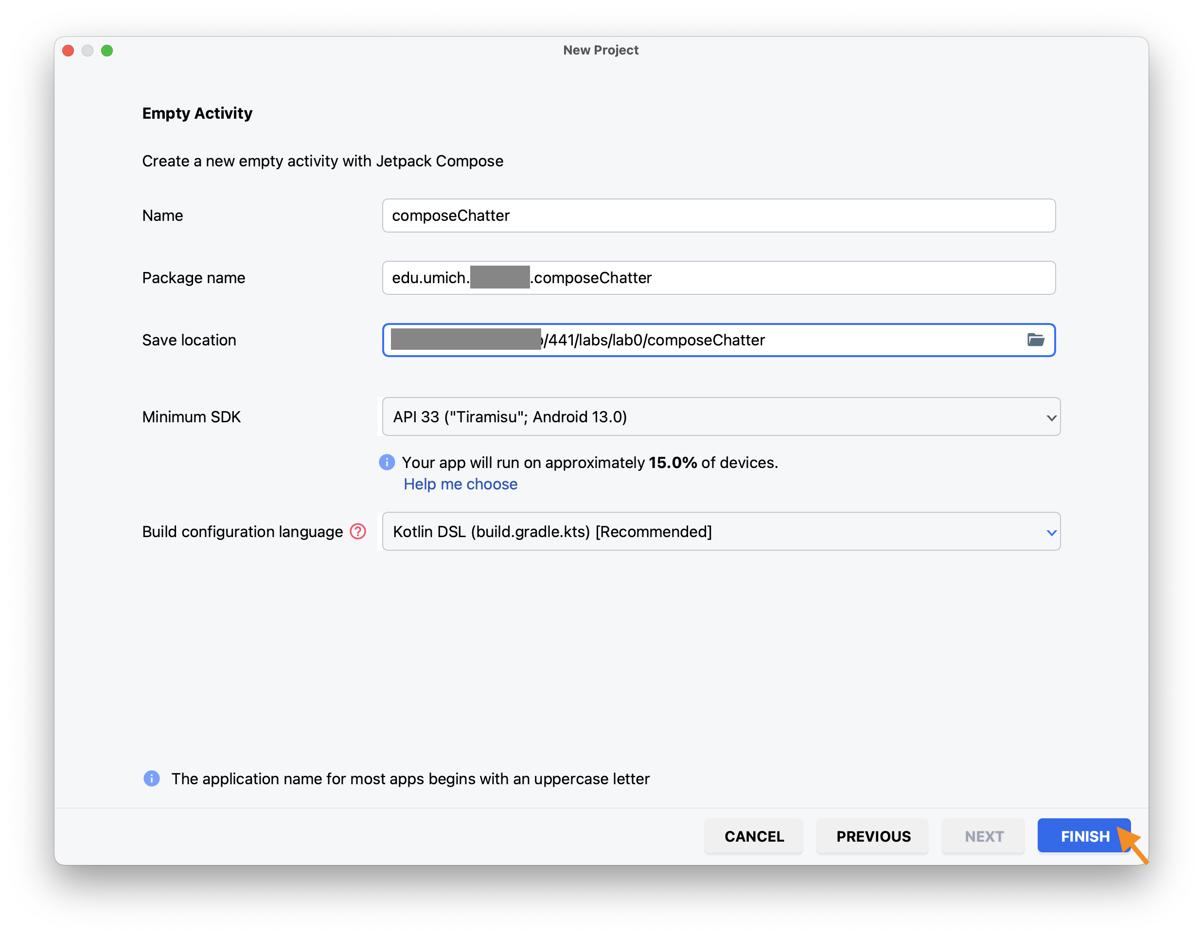
Subsequently in this and other tutorials, we will use the tag YOUR_PACKAGENAME to refer to your
package name. Whenever you see the tag, please replace it with your chosen package name.
Check in to GitHub
Open GitHub Desktop and
- Click
Current Repositoryon the top left of the interface - Click on the assignment GitHub repo you cloned above
- Add Summary to your changes and click
Commit to mainat the bottom of the left pane - If you have a team mate and they have pushed changes to GitHub, you’ll have to click
Pull Originand resolve any conflicts, re-commit to main, and - Finally click on
Push Originto push changes to GitHub
If you are proficient with git, you don’t have to use GitHub Desktop. However, we can only help with GitHub Desktop, so if you use anything else, you’re on your own.
 Go to the GitHub website to confirm that your folders follow this structure outline:
YOUR:TUTORIALS
    |-- Agent
        |-- app
        |-- gradle
If the folders in your GitHub repo does not have the above structure, we will not be able to grade your tutorials and you will get a ZERO.
Android Studio project structure
Set the left or Project pane of your Android Studio window to show your project structure in
Android view
(screenshot) such that
your project structure looks like this:

-
/app/manifests/AndroidManifest.xml: general app settings and activity list -
/app/kotlin+java/-
YOUR_PACKAGENAME: source code- MainActivity.kt: we will be modifying this source file later.
While we are not required to call the first activity of the app the
MainActivity(it can be changed inAndroidManifest.xml), it is a convention to do so and Android Studio automatically does this when it sets up a new project. - Color highlight on filenames indicates that the files have modifications not yet committed and pushed to Git repo. They will automatically turn off once changes are committed and pushed (including on GitHub Desktop).
- MainActivity.kt: we will be modifying this source file later.
-
YOUR_PACKAGENAME (androidTest): testing code to be run on device -
YOUR_PACKAGENAME (test): testing code to be run on development machine -
YOUR_PACKAGENAME.ui.theme:-
Color.kt: ARGB definition of color -
Theme.kt: Material Design 3 Theme with dark and light modes -
Type.kt: definition of type faces, weights, and sizes used
-
-
Theming and UI
One can easily spend a whole weekend (or longer) getting the theme “just right.” It’s best to just leave this folder alone, most of the time.
We won’t be grading you on how beautiful your UI looks. You’re free to design your UI
differently, so long as all indicated UI elements are functioning as specified and fully visible
and non-overlapping on the screen.
-
/app/res/: resource files-
drawable: vector image and icon assets -
mipmap: bitmap assets at different resolutions -
values: constants for colors, strings, themes (must not delete) -
xml: rules and configurations, such as security configuration
-
-
/Gradle Scripts: build scripts (see next section)
loading . . .
If your project pane doesn’t look like the above, wait for Android Studio to finish syncing and building and configuring, which usually take a long time on first load or after any project changes, your project should then be structured per the above.
Gradle build setup
Gradle scipt is the build script for your Android project. Staying in your Project pane, open the
file /Gradle Scripts/libs.version.toml. Under the [versions] block, update the following two
entries:
# . . .
kotlin = "2.4.0"
composeBom = "2026.06.00"
# . . .
“BoM” stands for “Bill of Materials.” It lists the latest versions of libraries as of the listed date that are compatible with each other.
At the bottom of the file, under the [plugins] section, add the line:
kotlinSerialization = { id = "org.jetbrains.kotlin.plugin.serialization", version.ref= "kotlin" }
Next, open the /Gradle Scripts/build.gradle.kts (Module:app) file.
this is the Module gradle file, listed second in /Gradle Scripts/, not the first listed Project gradle file /Gradle Scripts/build.gradle.kts (Project: agent).
At the top of the file add:
import org.jetbrains.kotlin.gradle.dsl.JvmTarget
Inside the plugins block, add the line:
alias(libs.plugins.kotlinSerialization)
After and outside the android block add:
kotlin {
    compilerOptions {
        jvmTarget.set(JvmTarget.JVM_11)
        optIn.addAll("androidx.compose.material3.ExperimentalMaterial3Api",
            "kotlinx.serialization.ExperimentalSerializationApi")
    }
}
Scroll down until you see the dependencies block near the bottom of the file and
add the following lines inside the block, below the other implementation statements:
    implementation("androidx.compose.material:material-icons-core:1.7.8")
    implementation("androidx.compose:runtime:runtime-retain:1.11.3")
    implementation("androidx.navigation:navigation-compose:2.9.8")
    implementation("com.squareup.okhttp3:okhttp:5.3.2")
    implementation("org.jetbrains.kotlinx:kotlinx-serialization-json:1.11.0")
OkHttp is a library from Square Inc. used for network transfers.
Kotlin serialization helps with converting Kotlin data structure to/from JSON.
Highlighted dependencies
Android Studio will highlight your newly added implementation dependencies. If you hover over the highlighted depency, for example over androidx.compose.material3:material3:1.4.0-alpha18, a dialog box pops up suggesting, Replace with new library catalog definition for androidx-material You can ignore the recommendation or accept by clicking on it. If you accept, the line will be replaced with:
implementation(libs.compose.material3)
and if you look into /Gradle Scripts/libs.versions.toml, you’ll see under [versions] a new entry has been added:
# . . .
material3 = "1.4.0"
and under [libraries] the following line has been added:
compose-material3 = { module = "androidx.compose.material3:material3", version.ref = "material3" }
You can accept (or not) all the recommendations to convert each of the remaining dependencies with the “new library catalog definitions.”
Should you accept the recommendations, click Sync Now on the right corner of the messsage bar that says Gradle files have changed since last project sync. . . . After a successful Gradle sync, it should then recognize the new libraries and all the new implementation lines should not be highlighted anymore.
compileSDK, minSDK, targetSDK
In the android block of your app build file, set compileSDK to the latest Android API level, e.g., 37. This will give you access to the latest Android libraries and compiler warnings of deprecated features or APIs. The compileSDK only affects the compilation step; the SDK is not bundled with your app.
Set the minSDK to the Android version running on your device or whose API your code depends on (sometimes APIs change signatures between Android versions). You can have compileSDK = 37 (Android 17), but minSDK = 34 (Android 14), for example.
Finally, there’s targetSDK, which is the Android version your app has been tested on. On a device running an Android version higher than your targetSDK, OS behavior (e.g., themes) released after your targetSDK will not be applied to your app. The targetSDK can be set between minSDK and compileSDK, usually it will be set to compileSDK.
Google PlayStore also has a minimum supported version (API Level 35 starting August 31st, 2025). Both minSDK and targetSDK (if different) will be bundled with your app.
Starting with Android 11 (API Level 11 (R)), when new APIs are added to a certain API level, it may also be made available as SDK Extensions to earlier API levels (see references).
Permission, colors, and strings
First we need user’s permission to use the network.
In AndroidManifest.xml, before the <application block, add:
<uses-permission android:name="android.permission.INTERNET"/>
Next we define some additional colors. Open the file /app/kotlin+java/YOUR_PACKAGENAME.ui.theme/Color.kt and add the following colors–some of these we will use in latter tutorials:
val WhiteSmoke = Color(0xFFEFEFEF)
val HeavenWhite = Color(0xFFFEFEFE)
val Gray88 = Color(0xFFE0E0E0)

val Chartreuse = Color(0xFFDFFF00)
val Moss = Color(0xFF526822)
val DarkGreen = Color(0xFF006400)

val Navy = Color(0, 39, 76)
val NavyLight = Color(0x8800274C)

val Maize = Color(255, 203, 5)
val MaizeLight = Color(0x88FFC84C)

val Canary = Color(0xFFFFC107)
val Firebrick = Color(0xFFB22222)
Finally, let’s define some strings. Open the file /app/res/values/strings.xml. Inside the resources block, below the line listing your name="app_name", add:
    <string name="send">Submit</string>
    <string name="model">gemma3:270m</string>
    <string name="message">howdy?</string>
    <string name="instruction">Type a message…</string>
Agent app
AppViewModel
Let’s start by defining AppViewModel to hold user’s choices and input. In addition to user input,
we also store here variables accessed by multiple SwiftUI Views. On Android, a ViewModel is a
special construct supported by the Android run time. Composables can share ViewModels. Once a
shared ViewModel is created, composables sharing it can simply reach out to the Android runtime to
access it. Add the following AppViewModel class to your MainActivity.kt file, outside the
MainActivity class:
class AppViewModel(app: Application): AndroidViewModel(app) {
    val rein = Rein("https://mada.eecs.umich.edu", "/llmprompt")

    val model = app.getString(R.string.model)

    val message = TextFieldState(app.getString(R.string.message))
    val instruction = app.getString(R.string.instruction)

    val errMsg = mutableStateOf("")

    var conversation = mutableStateListOf<Chat>()
}
The conversation array will be used to hold prompt and completion exchanges between the user and
LLM. It is initialized with mutableStateListOf() factory function, which makes it a
SnapshotStateList, an observable version of List. Similarly, the property errMsg is
initialized with mutableStateOf() factory function, which makes it an observable variable.
When a Jetpack Compose function (a composable) reads the value of an observable variable (the
subject), the composable is automatically subcribed to the subject, i.e., it will be
automatically recomposed whenever the value of the variable changes. If the subject is updated but
the new value is the same as the old value, recomposition will not be triggered (duplicates are
removed).
With auto import enabled, as you enter code, Android Studio automatically detects and determines which library to import.
In case of multiple potential matches, Android Studio would have you choose. Most of the time the choice would be rather obvious (pick the one with the word compose since we’re using Jetpack Compose, for example). We always provide a full list of imports as an Appendix to each tutorial spec. Compare your import list against the list in the Appendix when in doubt. Or you could cut and paste all of the imports into your source files before adding any code. If you choose to cut and paste the imports, be sure that you do NOT check Optimize imports on the fly in Android Studio’s Preferences/Settings, otherwise Android Studio will automatically remove them all for being unused and not needed.
Chat
We next define a Chat class to hold the prompt and completion we want to display. Create a new
Kotlin File (not Class):
Kotlin Class/File
When you select New > Kotlin Class/File, Android Studio defaults to creating
a Kotlin Class, which automatically adds a blank class definition for you,
whereas we want an empty file here. So be sure to choose File not Class
(screenshot).

Please remember this distinction between creating a Kotlin File vs. Class. You will need to make this distinction in all subsequent tutorials.
- Right click on
/app/kotlin+java/PACKAGE_NAMEfolder on the left/project pane - Select
New > Kotlin Class/File - Enter
ChatViewin theNametext field on top of the dialog box that pops up and double click onFile(again notClass). - Click
Addwhen prompted whether you want to add it to Git.
add the following Chat struct to the file:
data class Chat(val id: UUID = randomUUID(), // composable ID
                var role: String = "user",   // no observation
                val content: MutableState<String> = mutableStateOf(""),
                var timestamp: String = Instant.now().toString()) // no observation
Compose can use id to uniquely identify each instance of a Chat in a list.
When identifiable items in a list moved up or down the list but otherwise not modified,
Compose can skip recomposing them.
Rein
We now define the rein to control and communicate with the harness. Create another Kotlin File
(not Class) and name it Rein.kt.
We represent the request JSON data format for OpenAI /v1/chat/completions API with an
OpenAIRequest structure and its response with an OpenAIResponse structure. Put the following in
your Rein.kt:
// OpenAI-compatible request/response JSON formats
@Serializable
data class Message(
    val role: String = "user",
    val content: String = ""    // kotlin serialization cannot serialize MutableState
)

@Serializable
data class OpenAIRequest(
    val model: String,
    //val max_tokens: Int = 8192, // some models require it
    val messages: List<Message>,
    val stream: Boolean = true  // always streaming
)

@Serializable
@JsonIgnoreUnknownKeys
data class Delta(
    val role: String? = null,
    val content: String? = null
)

@Serializable
@JsonIgnoreUnknownKeys
data class Choice(
    val delta: Delta,
)

@Serializable
@JsonIgnoreUnknownKeys
data class OpenAIResponse(
    val model: String? = null,
    val choices: List<Choice>,   // guaranteed only one completion choice
    val created: Long? = null
)

enum class SseEvent { Error, Message }
The @Serializable annotation generates serialization code to convert Kotlin data types into
JSON strings and conversely convert JSON strings received from the network into Kotlin data types.
We also force streaming of the completion tokens, which will be streamed using the Server-Sent Event
(SSE) protocol. Our agent recognizes two SSE events, as encoded in the SseEvent enum class.
We now define the Rein class:
class Rein(
    val harness: String,
    val api: String,
    var apiKey: String? = null // WARNING: vulnerable to memory dump and man-in-the-middle attacks
) {
    private val JSONEncoder = Json {
        encodeDefaults = true // forces inclusion of all properties
    }

    // OkHttpClient

}
Rein control methods communicate with the back-end harness at the provided harness url and api
end point. You can use apiKey when connecting the agent directly to a LLM runner instead of through our back-end harness.
Connecting directly to an LLM runner
WARNING: NOT RECOMMENDED FOR SECURITY REASON
Third-party LLM runners, such as those from OpenAI, Anthropic, OpenRouter, etc., usually require an API key to use. Storing your API key on device is not recommended for security reasons:
- on mobile platforms, there is no equivalent to back-end
dotenvlibraries that load environment variables at run time. Instead such variables are usually stored in a local config file loaded to your app’s memory at build time. In-memory variables are vulnerable to memory dump. Mobile devices are considered less secure than hardened back-end servers because they are easier for an attacker to gain access, and - an attacker with access to your device can also mount a man-in-the-middle attack and spoof your server’s certificate to obtain your API key.
Instead, we’ve adopted the practice of keeping your API key in back-end server’s environment variables.
We use the OkHttp library for network communication with the back end. We first build a reusable
OkHttpClient, with connect, read, and write timeouts open for long-lived SSE streams. With
OkHttpClient, we get a callback-based Call API. To maintain a uniform, coroutine-based codebase,
we add an await() extension function to OkHttpClient’s Call interface. This extension bridges
the two APIs by registering a set of callback functions that explicitly resumes the suspending
function’s continuation. OkHttpClient invokes the appropriate callback function upon completion of
the enqueue() function of the Call interface. The await() extension further ensures that if
the calling coroutine is cancelled, the underlying network request is immediately aborted—which
triggers the onFailure() callback; in this case, we guard against calling resumeWithException
when the coroutine (and its continuation) has been cancelled.
Add the following code to your Rein class, replacing the comment // OkHttpClient:
    private val client = OkHttpClient.Builder()
        // no timeouts: https://www.baeldung.com/okhttp-timeouts
        .connectTimeout(0, TimeUnit.MILLISECONDS)
        .readTimeout(0, TimeUnit.MILLISECONDS)
        .writeTimeout(0, TimeUnit.MILLISECONDS)
        .build()
    private suspend fun Call.await() = suspendCancellableCoroutine { cont ->
        enqueue(object : Callback {
            override fun onResponse(call: Call, response: Response) {
                cont.resume(response)
            }
            override fun onFailure(call: Call, e: IOException) {
                if (cont.isCancelled) return // guards against resuming a cancelled coroutine
                cont.resumeWithException(e)
            }
        })

        cont.invokeOnCancellation {
            this@await.cancel() // i.e., Call.cancel(), triggers onFailure()
        }
    }

    // rein control
To send a prompt to the harness, the user calls the suspending function llmPrompt(). Replace //
rein control comment above with the following function definition:
    suspend fun llmPrompt(vm: AppViewModel, messages: List<Message>, completion: Chat) {
        val harnessApi = "${harness}${api}"

        // prepare prompt
    }
The harness in this tutorial serves as a straight-through proxy for the LLM runner. We can thus
send our prompt requests using OpenAI-compatible /v1/chat/completions API’s JSON data format:
{
    "model": string,
    "messages": [
        {
            "role": string,
            "content": string
        }
    ],
    "stream": boolean
}
We first assemble an instance of Kotlin OpenAIRequest data class comprising the expected key-value
pairs. We can’t just post the Kotlin data class as is though. The server may not be, and actually is
not, written in Kotlin, and could have a different memory layout for various data structures.
Presented with a chunk of binary data, the server will not know that the data represents a data
class, nor how to reconstruct the data class in its memory layout. To post the Kotlin data class, we
first call Json.encodeToString() to serialize the data class into a JSON string. We then put this
JSON string in a requestBody. Add the following code to your llmPrompt(), replacing // prepare
prompt:
        val openAIRequest = OpenAIRequest(
            model = vm.model,
            messages = messages
        )
        val requestBody = JSONEncoder.encodeToString(openAIRequest)
            .toRequestBody("application/json; charset=utf-8".toMediaType())

        // prepare request
Next we create an HTTP POST request using Request to carry the requestBody. Replace // prepare request with the following code:
        val request = Request.Builder()
            .url(harnessApi)
            .addHeader("Accept", "text/event-stream")
            .apply { // vulnerable to memory dump and man-in-the-middle attacks
                apiKey?.let {
                    addHeader("Authorization", "Bearer $it")
                }
            }
            .post(requestBody)
            .build()

        // connect to harness and send request
We initiate a connection to our harness back end and check that the connection has been made
successfully. If we fail to connect to our back end (the catch block) or the harness returned any
HTTP error, we simply report it to the user and end session, otherwise we collect the streamed
completion. Replace // connect to harness and send request with:
        try {
            val response = client.newCall(request).await()
            if (!response.isSuccessful) {
                vm.errMsg.value = "${response.code}\n$harnessApi\n${response.body.string()}"
                return
            }

            collectCompletion(response.body.source(), completion, vm.errMsg)

        } catch (e: Throwable) {
            vm.errMsg.value = "llmPrompt: ${e.localizedMessage ?: "failed"}"
        }
The errMsg property is of type MutableState<String>, which means that updating its value will
notify observers of the change. We’ll see later that updating vm.errMsg causes an alert dialog box
to pop up, to warn the user.
We now parse the incoming SSE stream to collect the returning completion. Add the following
collectCompletion() helper method to your Rein class:
    suspend fun collectCompletion(stream: BufferedSource, completion: Chat, errMsg: MutableState<String>) {

        var sseEvent = SseEvent.Message
        while (!stream.exhausted()) {
            val line = stream.readUtf8Line() ?: continue

            if (line.isEmpty()) {
                if (sseEvent == SseEvent.Error) {
                    completion.content.value += "\n\n**llmPrompt SSE Error**: ${errMsg.value}\n\n"
                }

                // new SSE event, default to Message
                // SSE events are delimited by '\n\n'
                sseEvent = SseEvent.Message
                continue
            }

            // parse SSE line

        }
    }
When an empty line is detected, if we are in an Error event block, we report the error on the
timeline (which pops up an alert dialog box in the UI). Then we reset the event to the default
Message event.
If the next line starts with the text event, we’re starting a new named event block, otherwise,
it’s a data line and we handle (save) it depending on the event it’s associated with. By the SSE
spec, when unspecified, Message is the default event name.
Each SSE line is a string, no quotation marks are used to further indicate that it is a string.
OpenAI’s /v1/chat/completions API further requires that either [DONE] or a serialized JSON
object follows a data: tag. Replace the comment // parse SSE line above with:
                // parse SSE line
                val parts = line.split(":", limit = 2)
                if (parts.size != 2) {
                    // should not happen, debug print
                    Log.d("LLMPROMPT", "malformed SSE line: $line")
                    continue
                }
                val tag = parts[0]
                val tagline = parts[1].trim()
                if (tag == "event") {
                    // https://medium.com/@manoel.al.amaro/understand-kotlin-flow-coroutines-by-implementing-server-side-sent-sse-9e190ff5f24f
                    if (tagline == "error") {
                        sseEvent = SseEvent.Error
                    } else if (!tagline.isEmpty() && tagline != "message") {
                        // we only support "error" event, "message"
                        // events are assume implicit by the SSE spec.
                        // should not happen, debug print
                        Log.d("LLMPROMPT", "Unknown event: '${parts[1]}'")
                    }
                } else if (tag == "data") {
                    // not an event line, we only support data line;
                    if (tagline.isEmpty() || tagline == "[DONE]") {
                        // OpenAI's `/v1/chat/completions` uses "data: [DONE]"
                        // to indicate end of strea
                        continue
                    }
                    // multiple data lines can belong to the same event
                    try {
                        // OpenAI's `/v1/chat/completions` API requires that
                        // a serialized JSON object follows a `data:` tag.
                        val openAIResponse = Json.decodeFromString<OpenAIResponse>(tagline)

                        // extract content from choices[0].delta.content.
                        // we specified no alternative completion earlier
                        // with OpenAIRequest.n = 1
                        openAIResponse.choices.firstOrNull()?.delta?.content?.let { token ->
                            if (token.isNotEmpty()) {
                                if (sseEvent == SseEvent.Error) {
                                    errMsg.value += token
                                } else {
                                    completion.content.value += token
                                    if (completion.timestamp.isEmpty()) {
                                        openAIResponse.model?.let {
                                            completion.role = "assistant ($it)"
                                        }
                                        val created = openAIResponse.created ?: (System.currentTimeMillis() / 1000)
                                        completion.timestamp = Instant.ofEpochSecond(created).toString()
                                    }
                                }
                            }
                        }
                    } catch (e: IllegalArgumentException) {
                        errMsg.value += "${e.localizedMessage}\n$harness$api\n$line"
                    }
                }
We are done with the Rein our agent uses to control and communicate with the harness and LLM. We
now turn to the UI user uses to interact with the agent.
MainActivity
Returning to MainActivity.kt, delete the composable functions Greeting() and
GreetingPreview(). Replace your MainActivity class definition with the following: ```kotlin
class MainActivity : ComponentActivity() {
override fun onCreate(savedInstanceState: Bundle?) {
super.onCreate(savedInstanceState)
enableEdgeToEdge()
    setContent {
        MainView()
    }
} } ``` As a general rule, a `@Composable` function can only be called by another `@Composable` function. The only exception is `setContent()`, which binds the given composable to an `Activity` as the content view of the `Activity`. It is the only non-composable allowed to call a composable.
@Preview and LiveEdit
When Android Studio created MainActivity.kt it also put in it a @Preview block. As the name implies, the @Preview code allows you to preview your composables. The preview only renders your composable, it is not an emulator: it won’t populate your composable with data. Given the simple, single-page nature of our apps, I found the preview to be of limited use and would just delete or comment out the whole @Preview block, which automatically disables the preview and closes the Design (or Split) pane. The video, Compose Design Tools, shows you what is possible with @Preview. Also check out the @Preview section of the References below.
Android Studio Giraffe and higher supports LiveEdit which “update composables in emulators and physical devices in real time.” While @Preview allows you to see your UI design in different themes, locales, and UI element settings but does not actually run the rest of your app, LiveEdit updates your actual running app. “Live Edit is focused on UI- and UX-related code changes. It doesn’t support changes such as method signature updates, adding new methods, or class hierarchy changes.”
ConversationView
We want to display user exchanges with the LLM runner in a conversation view. First we define what
each row of the conversation contains. Go back to your ChatView.kt file and add the following composable:
@Composable
fun ChatView(chat: Chat, onTrailingEnd: Boolean) {
    Column(
        horizontalAlignment = if (onTrailingEnd) Alignment.End else Alignment.Start,
        modifier = Modifier
            .fillMaxWidth()
            .padding(horizontal = 16.dp, vertical = 8.dp)
    ) {
            // chat displayed here
    }
}
For each chat, we check whether we’re displaying the user’s message or a response from the LLM.
In the former case, we display the row flushed to the trailing/end edge of the screen, else flushed
to the other edge. The modifier fillMaxWidth() forces the Column to use the full width of the
screen.
If your locale has a language that reads left to right, start is left; otherwise, start is
right (conversely, end). Most of the time you would use start and end to refer to the two
ends of a UI element, reserving left and right for use with the physical world, e.g., when
giving direction.
Below we check if the message is empty. If it’s not empty, we first display the model used if it’s
from the “assistant” (LLM). Then we display the message in a “message bubble,” followed
by the timestamp on the message. We put these three elements inside a Column which arranges its
elements in a vertical stack. Add the following lines inside your Column(){} block, replacing
// chat displayed here:
        val msg = chat.content
        if (msg.value.isNotEmpty()) {
            Text(
                text = if (onTrailingEnd) "" else chat.role,
                style = MaterialTheme.typography.labelLarge,
                color = PurpleGrey40,
                modifier = Modifier
                    .padding(start = 4.dp)
            )

            Text(
                text = msg.value,
                style = MaterialTheme.typography.bodyLarge,
                modifier = Modifier
                    .shadow(2.dp, shape = RoundedCornerShape(20.dp))
                    .background(if (onTrailingEnd) Chartreuse else HeavenWhite)
                    .padding(12.dp)
                    .widthIn(min = 50.dp, max = 350.dp)
            )

            Text(
                text = chat.timestamp,
                color = Color.Gray,
                style = MaterialTheme.typography.labelSmall,
                modifier = Modifier
                    .padding(top = 4.dp, start = 8.dp)
            )
        }
Hover over the red elements and import any missing classes. Usually the first choice with compose
in its package name is the right one.
“dp”, “px”, “sp”
Aside from different screen sizes, different Android devices also have different screen densities, i.e., number of pixels per inch. To ensure UI elements have more-or-less uniform sizes on screens with different densities, Google recommends that sizes be expressed in terms of device-independent pixels (dp) which is then displayed using more or less pixels (px) depending on screen density (see also Cracking Android Screen Sizes and Designing for Multiple Screen Densisites on Android).
Text sizes are measured in sp (scale-independent-pixel) unit, which specifies font sizes relative to user’s font-size preference—to assist visually-impaired users.
You can hover over a composable (e.g., Column, Text, or Scaffold) to bring up a menu of
possible actions on it.
DSL
Notice how type inference and the use of trailing lamba makes Row, Column, Text, etc. look and
act like keywords of a programming language, separate from Kotlin. Thus Compose is considered a
“domain-specific language (DSL),” the “domain” in this case being UI
description.
Now that we have a description of each row, we can put the rows in a list. Put the
the following View in your ChatView.kt file, outside the ChatView composable:
@Composable
fun ConversationView(modifier: Modifier, listScroll: LazyListState) {
    val vm: AppViewModel = viewModel()

    LazyColumn(
        modifier = modifier,
        verticalArrangement = Arrangement.spacedBy(12.dp),
        state = listScroll,
    ) {
        // import androidx.compose.foundation.lazy.items
        items(items = vm.conversation, key = { it.id as Any }) {
            ChatView(it, it.role == "user")
        }
    }
}
The variable listScroll is used to scroll the list programmatically. Here we’re simply assigning
the provided LazyListState to the LazyColumn. We will use it in SubmitButton later to scroll
the list programmatically.
For each element in the conversation array , ChatView constructs and returns a composable, which
LazyColumn then displays. LazyColumn only loads array elements that are visible on screen. The
function items() recomposes an item iff the key of that item has changed—for example, if a
row’s chat.id has not changed, the row will not be recomposed even if it gets moved around the
array. Without id, each row will be recomposed if it moves up or down in the array even if the
content of the row hasn’t changed.
Recall that the conversation array is a MutableStateList. When a composable accesses
conversation, Compose automatically subscribes the composable to the conversation property so
that the composable can be automatically recomposed whenever conversation is modified.
ConversationView helps ChatView determine which edge of the screen to display a chat by
comparing the role property of the chat.message against the string "user".
SubmitButton
SubmitButton sends each user’s prompt to the back end and receives the LLM’s completion. Create
another new Kotlin File, name it MainView.kt, and put the following code in it:
@Composable
fun SubmitButton(listScroll: LazyListState) {
    val vm: AppViewModel = viewModel()

    var isSending by retain { mutableStateOf(false) }
    // `by` property delegation needs to import `setValue`
    // and `getValue` separately, so do import twice
    // If Android Studio doesn't give you any import option, wait
    // a few minutes, usually it will then find the imports.

    IconButton(
        onClick = {
            isSending = true

            val chat = Chat(content =
                mutableStateOf(vm.message.text.toString())
            )
            vm.conversation.add(chat)

            // pass chat to harness in an array of `messages`
            // but kotlin serialization cannot serialize MutableState
            // so must manually convert Chat.content.value to Message.content
            val messages = listOf(Message(chat.role, chat.content.value))

            // prepare completion placeholder
            val completion = Chat(role = "assistant (${vm.model})",
                    content = mutableStateOf(""), timestamp = "") // placeholder for assistant's streaming completion
            vm.conversation.add(completion)

            vm.viewModelScope.launch(Dispatchers.IO) {
                vm.rein.llmPrompt(vm, messages, completion)

                // continuation code

            }
        },
        // modifiers

    ) {
        // icons

    }
}
When the button is clicked, we set isSending to true and add the user prompt to conversation
array. We want each arriving stream element to be displayed right away. To hold the response stream,
we create a placeholder completion: Chat and append it also to the conversation array. Then we
call llmPrompt(), passing it the user prompt. Compose will later reactively display the updated
conversation array. The function llmPrompt() expects the user prompt to be put in an array of
messages. We launch llmPrompt() using vm.viewModelScope so that our network operations
survives the composable and Activity lifecycles, which got terminated when you change the
orientation of your device, for example.
remember and retain
As previously discusssed, to make a variable observable, we give it a MutableState type using
mutableStateOf() or mutableStateListOf(). A composable that accesses an observable variable
automatically subscribes to it. You don’t need to use remember() to subscribe to a published
variable. Use remember() only if you want to retain states declared in composables across
recompositions. This is normally used for view-logic states.
Other than recomposition, states in a composable can also be destroyed by events impacting
Activity lifecycle, such as device-orientation change. To save composable states across changes in
orientation, we use the new retain() Compose API.
There’s also the more established rememberSaveable() Compose AI that serializes states and stores
them to Android OS memory whenever the app is moved to the background. This allows developers to (1)
opt to retain states when switching between screens of a bottom navigation tab and (2) manually
restore states when the app restarts after being evicted by the system due to low available memory.
States in a singleton object and in ViewModels are not destroyed across recompositions, nor when
switching between screens of a bottom navigation tab. ViewModels can be explicitly saved and restored
using SavedStateHandle to survive process death.
There are three ways we can use remember():
- Directly assign a remembered mutable state to a variable:
val message = remember { mutableStateOf("A message") } // type: MutableState<String>the variable will then be of type
MutableState<T>. To modify the value stored in the variable, we modify it’svalueproperty, e.g.,message.value = "Another message". This method is required to specifyMutableState<T>as a function or (data)class parameter. - Use property delegation (
by):val message by remember { mutableStateOf("A message") } // type: Stringwe implicitly cast the state object as object of type
Tin Compose, which makes working with the variable more convenient, e.g., we can directly assign a literal value of typeT(Stringin this case) to the variable. This is the most convenient method when it is applicable. - Or destructure the remembered state into its getter and setter:
val (message, setMessage) = remember { mutableStateOf("A message") }The getter (
message) is then used to read the state and its setter (setMessage) to set the state. When used with legacy version ofTextField(), itsvalueparameter will be assigned the getter,message, and itsonValueChangeparameter assigned the setter,setMessage. Note that destructuredmessageis not updated (it’s aval) whensetMessageis called. If the assignment is inside a composable functionmessageis re-initialized during recomposition so it looks like it is updated.
Upon returning from llmPrompt(), we reset vm.message and isSending. Then we scroll the display
to the bottom of the displayed conversation using animateScrollToItem. Add the following code
inside the launch {} block, replacing the comment // continuation code:
                // cleanup
                vm.message.clearText()
                isSending = false
                listScroll.animateScrollToItem(vm.conversation.size)
To disable the button if isSending is true or if there’s no message to send,
add the following modifiers to IconButton by replacing the comment // modifiers:
        modifier = Modifier
            .size(55.dp)
            .background(if (vm.message.text.isEmpty()) NavyLight else Navy,
                shape = CircleShape),
        enabled = !(isSending || vm.message.text.isEmpty()),
For the icon itself, we provide two options: one to show a “loading” view if we’re
waiting for response from the LLM (isSending is true) and one to show a “paperplane”
submit icon otherwise. Add the following code as IconButton’s content parameter, replacing the
comment // icons:
        if (isSending) {
            CircularProgressIndicator(
                color = Gray88,
                strokeWidth = 4.dp,
                modifier = Modifier.size(24.dp)
            )
        } else {
            Icon(
                Icons.AutoMirrored.Filled.Send,
                contentDescription = stringResource(R.string.send),
                tint = if (vm.message.text.isEmpty()) MaizeLight else Maize,
                modifier = Modifier.size(28.dp)
            )
        }
Again, hover over the red elements and import any missing classes. Usually the first choice with
compose in its package name is the right one. For Instant, you need to import
java.time.Instant instead of kotlin.time.Instant. Property delegation using by requires import
of androidx.compose.runtime.setValue and androidx.compose.runtime.getValue as two separate
import action, so you’d need to hover over by and do the import twice.
MainView
We now have all the pieces we need to build our MainView. Add to your
MainView.kt, outside the SubmitButton:
@Composable
fun MainView() {
    val vm: AppViewModel = viewModel()

    val layoutDirection = LocalLayoutDirection.current
    val listScroll = rememberLazyListState()
    val focus = LocalFocusManager.current

    Scaffold(
        topBar = {
            TopAppBar(
                title = {
                    Text(
                        text = stringResource(R.string.app_name),
                        fontSize = 20.sp,
                        fontWeight = FontWeight.Bold,
                        modifier = Modifier.fillMaxWidth(),
                        textAlign = TextAlign.Center
                    )
                },
                colors = TopAppBarDefaults.topAppBarColors(WhiteSmoke),
            )
        },
        // tap background to dismiss keyboard
    ) {
        // describe the content
    }
}
We initialize a LazyListState that we will pass to ConversationView to control the scrolling of
the LazyColumn it instantiates. The scrolling itself is done in SubmitButton.
Scaffold is a composable that implements the basic Material Design visual layout structure,
providing slots for the most common top-level components such as topbar, floating action button, and
others. By using Scaffold, we ensure the proper positioning of these components and that they
interoperate smoothly. Scaffold, TopAppBar are examples of layout composables that follow the
slot-based layout, a.k.a. Slot
API pattern of Compose. In
our case, we add a TopAppBar that consists of only a textbox containing the string llmPrompt.
Why topBar = { TopBar() }?
The topBar parameter of Scaffold take as argument a composable with zero parameter and Unit
return value. In Kotlin, a function is not a reference, to assign the composable function
TopAppBar() to topBar, we must wrap it in a parameterless lambda returning Unit value, which
we did above.
When the user taps anywhere on the screen other than the TextField below, we want to dismiss the
soft keyboard. Replace // tap background to dismiss keyboard with:
        modifier = Modifier
            .pointerInput(Unit) {
                detectTapGestures { focus.clearFocus() }
            }
Scaffold’s last parameter, content, also takes a composable as argument. Since it is the last
argument, we have presented it as a trailing lambda in the above. We’ll show the conversation
here. Replace // describe the content with the following code:
        Column(
            modifier = Modifier
                .fillMaxSize()
                .imePadding()
                .padding(
                    it.calculateStartPadding(layoutDirection),
                    it.calculateTopPadding(),
                    it.calculateEndPadding(layoutDirection),
                )
                .background(color = WhiteSmoke),
        ) {
            ConversationView(modifier = Modifier.weight(1f), listScroll)

            // prompt input and submit
        }
The modifier imePadding() causes the Column to not vertically extend behind the soft keyboard.
The padding() modifier sets padding according to the safe area of the screen, but let the bottom
padding extends to the edge of the screen. Then MainView puts the ConversationView at the top of
its column.
Below ConversationView, we now put a text box, where user can enter their LLM prompt, and the
SubmitButton. We put these text box and button inside a Row. Elements in a Row are displayed
side by side horizontally. Replace // prompt input and submit with:
            Row(horizontalArrangement = Arrangement.SpaceEvenly,
                verticalAlignment = Alignment.CenterVertically,
                modifier = Modifier
                    .fillMaxWidth(1f)
                    .imePadding()
                    .background(color = WhiteSmoke)
                    .padding(top = 4.dp, start = 20.dp, end = 20.dp, bottom = 40.dp)
            ) {
                OutlinedTextField(
                    state = vm.message,
                    placeholder = {
                        Text(text = vm.instruction, color = Color.Gray)
                    },
                    shape = RoundedCornerShape(40.dp),
                    modifier = Modifier
                        .weight(1f)
                        .padding(end = 12.dp),
                    textStyle = LocalTextStyle.current.copy(fontSize = 18.sp),
                    colors = TextFieldDefaults.colors(
                        unfocusedContainerColor = HeavenWhite,
                        focusedContainerColor = HeavenWhite,
                        focusedIndicatorColor = Color.Transparent,
                        unfocusedIndicatorColor = Color.Transparent
                    ),
                    lineLimits = TextFieldLineLimits.MultiLine(1, 6),
                )
                SubmitButton(listScroll)
            }

            // show error
OutlinedTextField can modify vm.message as if it were passed by reference. We also give
vm.instruction to OutlinedTextField, which will be shown as a “background” text that
automatically goes away when the user starts typing. We also pass listScroll to SubmitButton so
that it can programmatically scroll the screen to the last item it added to the conversation array.
Before we leave MainView, we check whether vm.errMsg is empty. If it’s not empty, we show an
alert dialog with the content of vm.errMsg as the error message. Replace // show error with:
            if (vm.errMsg.value.isNotEmpty()) {
                AlertDialog(
                    modifier = Modifier
                        .shadow(0.dp, shape = RoundedCornerShape(20.dp))
                        .padding(12.dp)
                        .widthIn(min = 30.dp, max = 300.dp),
                    onDismissRequest = {
                        vm.errMsg.value = ""
                    },
                    title = {
                        Text(
                            "LLM Error",
                            fontWeight = FontWeight.Bold
                        )
                    },
                    text = {
                        Text(
                            vm.errMsg.value,
                            fontSize = 20.sp,
                            lineHeight = 24.sp,
                            letterSpacing = 0.5.sp
                        )
                    },
                    confirmButton = {
                        TextButton(onClick = {
                            vm.errMsg.value = ""
                        }) {
                            Text(
                                "OK",
                                fontSize = 28.sp,
                                fontWeight = FontWeight.Bold,
                            )
                        }
                    },
                )
            }
Again, hover over the red elements and import any missing classes. Usually the first choice with compose in its package name is the right one.
Congratulations! You’re done with the front end! (Don’t forget to work on the back end!)
Run and test to verify and debug
You should now be able to run your front end against the provided back end on mada.eecs.umich.edu.
If you’re not familiar with how to run and test your code, please review the instructions in the Getting Started with Android Development.
Completing the back end
Once you’re satisfied that your front end is working correctly, follow the back-end spec to build your own back end:
With your back end completed, return here to prepare your front end to connect to your back end via HTTP/2 with HTTPS.
Installing your self-signed certificate
Download a copy of your harnessd.crt to /YOUR:TUTORIALS/ folder on your laptop. Enter the
following commands:
laptop$ cd /YOUR:TUTORIALS/
laptop$ scp -i agentic.pem ubuntu@YOUR_SERVER_IP:agentic/harnessd.crt harnessd.crt
Install harnessd.crt onto your Android: download harnessd.crt from your laptop onto your emulator or device:
-
If you don’t see your device mirrored on Android Studio, connect it to Android Studio for USB debugging, then turn on device mirroring by selecting
File/Android Studio > Settings > Tools > Device Mirroringand checkingEnable mirroring of physical Android device. To view the mirrored device, selectView > Tool Windows > Running Devices. -
With your emulator or mirrored device visible in your Android Studio, drag
harnessd.crton your laptop and drop it on the home screen of the emulator or mirrored device.Alternatively, you could also email
harnessd.crtto yourself, then on the device/emulator, view your email and tap the attachedharnessd.crt.
You can verify that your certificate is installed in Settings > Security & privacy > More security settings > Encryption & credentials > User credentials.
To test the installion, launch a web browser on the emulator or device and access your server at
https://YOUR_SERVER_IP/ (you’d have to enable your / API to do this test).
Preparing Agent
Next, we need to tell your app to trust the self-signed certificate.
On the left pane in Android Studio, right click the xml folder in /app/res/, choose New > File in the drop-down menu. Name the new XML file network_security_config.xml and put the following content in the file:
<?xml version="1.0" encoding="utf-8"?>
<network-security-config>
    <domain-config>
        <!--                            👇👇👇👇👇👇👇👇👇 -->
        <domain includeSubdomains="true">YOUR_SERVER_IP</domain>
        <trust-anchors>
            <certificates src="user"/>
        </trust-anchors>
     </domain-config>
</network-security-config>
WARNING: be sure to limit the use of the self-signed certificate to your back-end server IP as
shown above. In particular use <domain-config> instead of the <base-config> tag because the
latter will cause your app to try and fail to apply the self-signed certificate with other services,
such as Google Maps.
Add the following line that accounts for the new file to your AndroidManifest.xml, above the
existing android:theme line:
<application
    <!-- ... other items -->
    android:networkSecurityConfig="@xml/network_security_config"
    android:theme="@style/Theme.Agent">
Finally, change the harness property of your Rein instantiation in MainActivity.kt from
https://mada.eecs.umich.edu to https://YOUR_SERVER_IP. Build and run your app and you should now
be able to connect your mobile front end to your harness via HTTPS. Your front end must work with
both mada.eecs.umich.edu and your own harness.
You will not get full credit if your submitted front end is not set up to work with your harness!
Front-end submission guidelines
We will only grade files committed to the main branch. If you’ve created multiple branches, please
merge them all to the main branch for submission.
Push your front-end code to the same GitHub repo you’ve submitted your back-end code:
- Open GitHub Desktop and click
Current Repositoryon the top left of the interface - Click on the GitHub repo you created at the start of this tutorial
- Add Summary to your changes and click
Commit to mainat the bottom of the left pane - Since you have pushed your back end code, you’ll have to click
Pull Originto synch up the repo on your laptop - Finally click
Push Originto push all changes to GitHub
Go to the GitHub website to confirm that your front-end files have been uploaded to
your GitHub repo under the folder agent. Confirm that your repo has a folder structure outline
similar to the following. If your folder structure is not as outlined, our script will not pick up
your submission, you will get ZERO point, and you will have problems getting started on latter
tutorials. There could be other files or folders in your local folder not listed below, don’t delete
them. As long as you have installed the course .gitignore as per the instructions in Preparing
GitHub for Reactive Tutorials and
Projects, only files needed for
grading will be pushed to GitHub.
YOUR:TUTORIALS
    |-- harnessd
    |-- harnessd.crt
    |-- Agent
        |-- app
        |-- gradle
Verify that your Git repo is set up correctly: on your laptop, grab a new clone of your repo and build and run your submission to make sure that it works. You will get ZERO point if your tutorial doesn’t open, build, or run.
IMPORTANT: If you work in a team, put the names and uniqnames of all members in your repo’s
README.md so that we’d know (click the pencil icon at the upper right corner of the README.md
box on your git repo to edit). Otherwise, we could mistakenly think that you were cheating and
accidentally report you to the Honor Council, which would be a hassle to undo. You don’t need a
README.md if you work by yourself.
Invite eecsreactive@umich.edu to your GitHub repo. Enter your uniqname (and that of your team
mates’) and the link to your GitHub repo on the Tutorial and Project Links
sheet.
The request for teaming information is redundant by design.
References
Dev
- Android Studio
- Gradle: build tool and dependency manager for Android
-
The Android SDK Version Trinity
<!– Picking your compileSdk
Version, minSdkVersion, and targetSdkVersion - Google Play developer account
- GooglePlay’s Testing Tracks
- Publishing app to Play Store
OkHttp3
- okhttp3
- How does OkHttp get Json string?
- Android Http Requests in Kotlin with OkHttp
- OkHttp3 Response
- OkHttp3 ResponseBody
- OkHttp3 executeAsync [nonJvm]
SSE
Jetpack Compose Concepts
- Understanding Jetpack Compose
- Thinking in Compose
- Architecting your Compose UI
- Layouts in Compose
- Slot API
- Lists
- State and Jetpack Compose
- Observer vs Pub-Sub pattern
- Navigating with Compose
- Get started with Jetpack Compose
- Compose tooling
- Material Components and layout
Tutorial Pathways
Documentations
- Use Android Studio with Jetpack Compose
- androidx.compose
- Scaffold
- Column
- LazyColumn
- Button
- MutableState
- mutableStateOf()
- mutableStateListOf()
- remember
- retain
- rememberSaveable
3rd-party articles on Jetpack Compose
Depending on date of publication, Compose APIs used in 3rd-party articles may have been deprecated or their signatures may have changed. Always consult the authoritative official documentation and change logs for the most up to date version.
Screen sizes and densities
- How to Find Device Metrics for Any Screen
- Designing for multiple screen densities on Android
- DP vs SP vs DPI vs PX in Android
- Screen sizes and densities market distribution
- Screen compatibility overview
Layout and Components
ViewModel
ConstraintLayout and Compose
LiveEdit and @Preview
- Deep dive into Live Edit for Jetpack Compose UI
- Iterative code development
- Composable Preview
- Jetpack Compose and Composable Preview
- Jetpack Compose Preview like a pro
- The power of @Preview
Themes and Styles
- Setting up Themes
- How to create a truly custom theme in Jetpack Compose
- Surfaces
- Sample Code with Surface
- Material Design Color System scroll all the way down until you get to the “2014 Material Design color palettes”
- Access default icon in SDK
- Material Design Icons
- Material Design Icons Guide
- Add multi-density vector graphics
Appendix: imports
| Prepared by Alex Wu, Tiberiu Vilcu, Nowrin Mohamed, Chenglin Li, Xin Jie ‘Joyce’ Liu, and Sugih Jamin | Last updated: June 21st, 2026 |